01
The logo
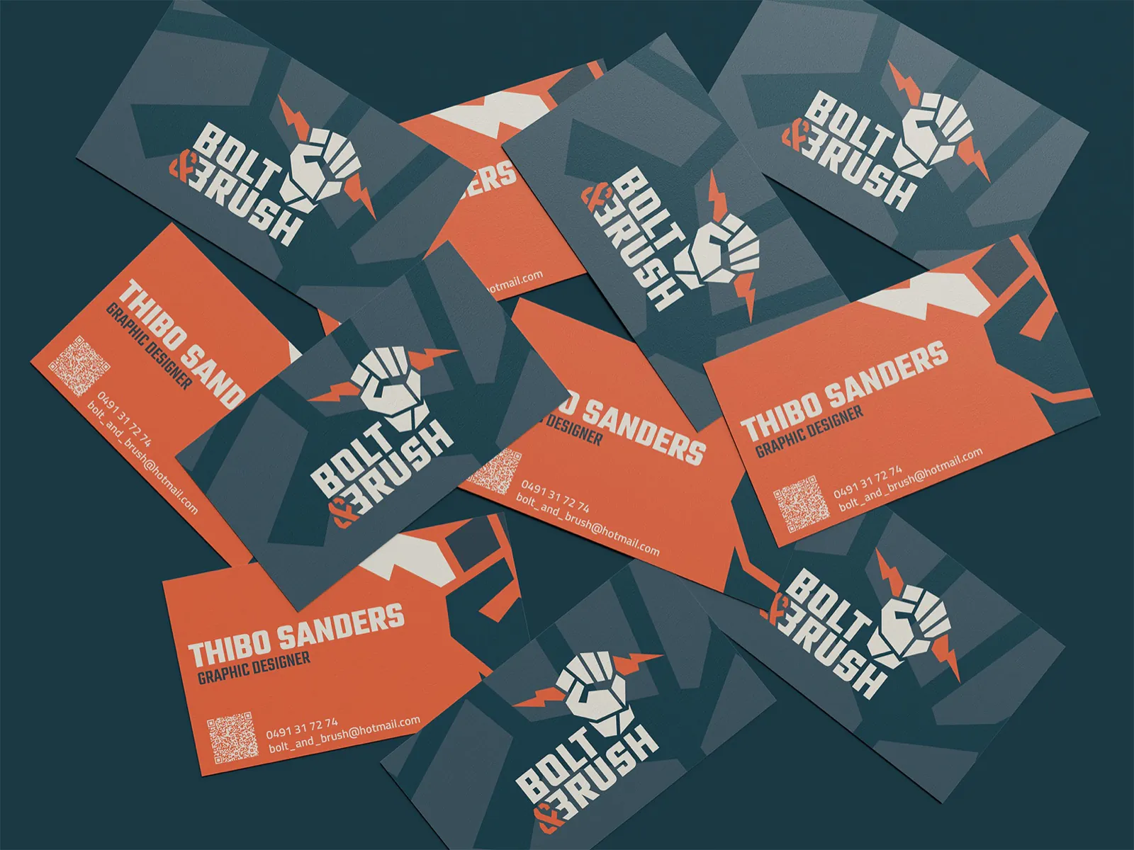
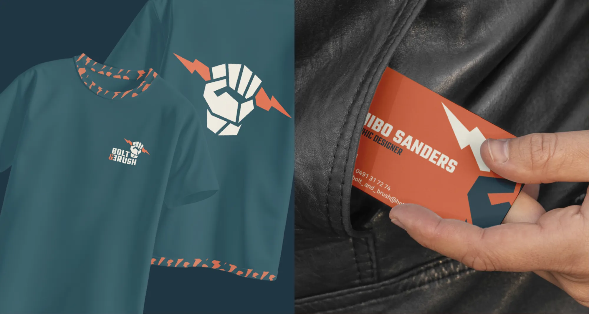
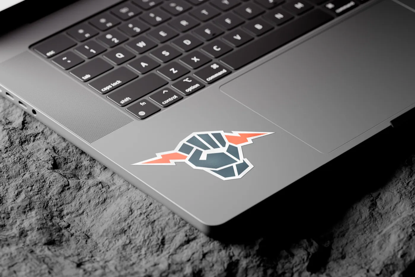
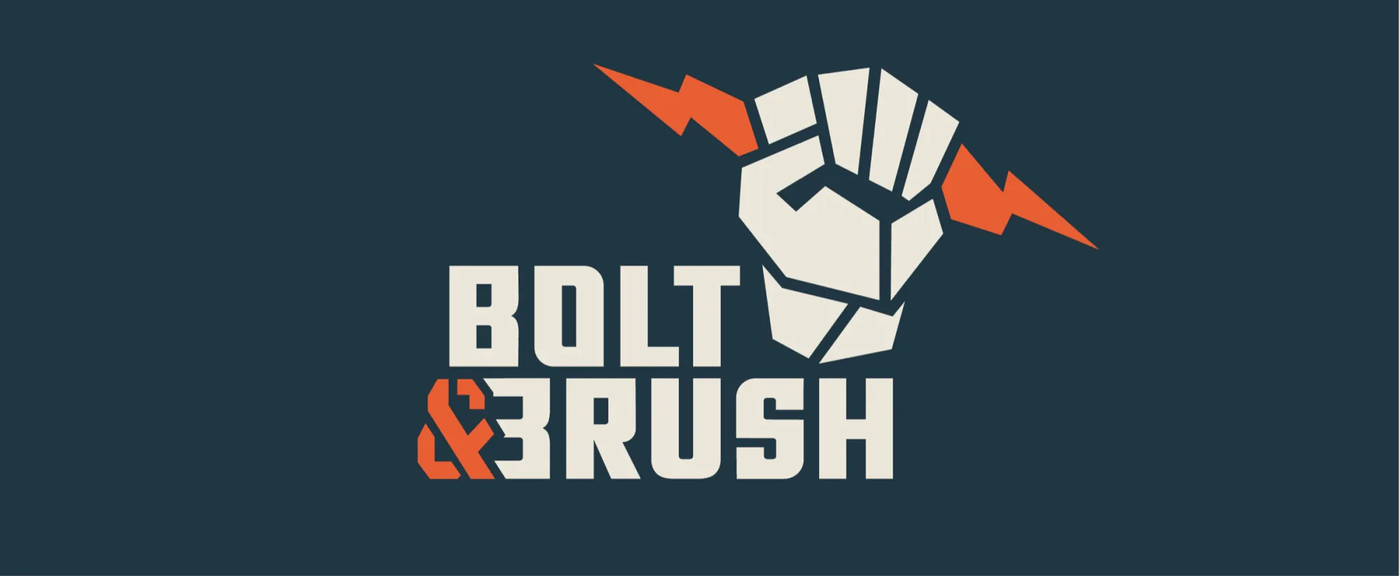
The fist stands for guts, the brush for craft and the lightning for the energy a design needs to strike. Built from angular shapes, so it also works small and in one colour.
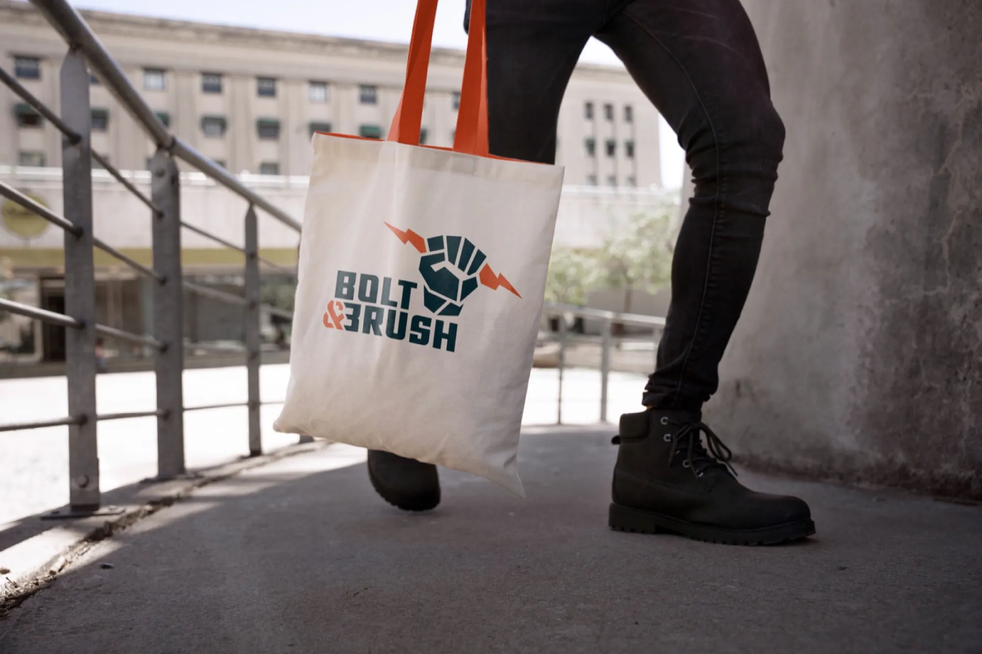
I wanted a brand that shows who I am as a designer: bold, honest and a little rebellious. Not a well-behaved logo, but something you remember.
A fist holding a brush, with a lightning bolt through it. Strength and craft in one image. Around it I built an identity in gunmetal, bone and a vivid cinnamon.
The fist stands for guts, the brush for craft and the lightning for the energy a design needs to strike. Built from angular shapes, so it also works small and in one colour.
Gunmetal is the base, bone brings calm and cinnamon only appears as an accent, so it keeps standing out.
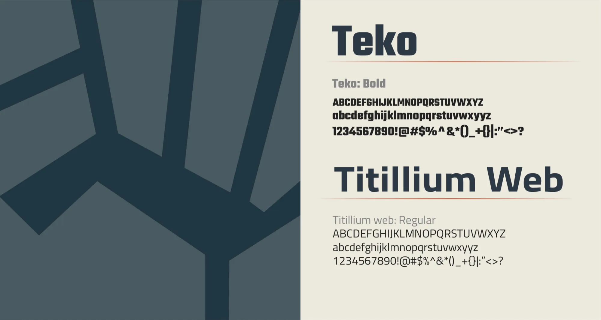
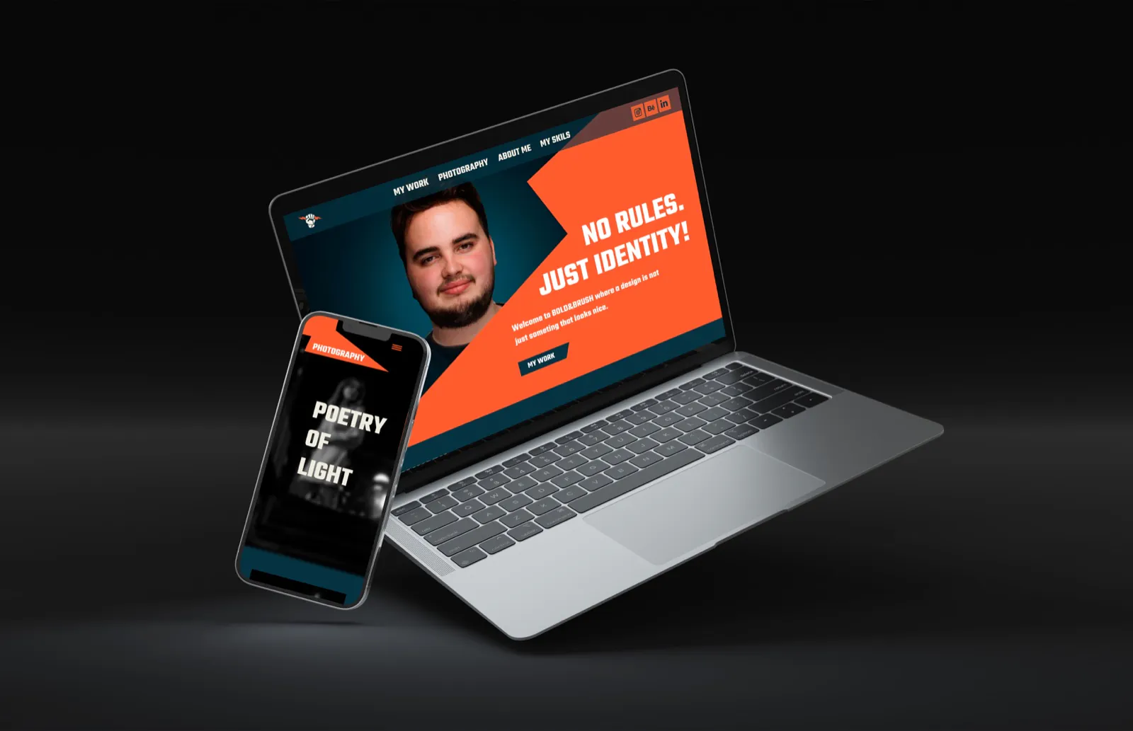
Teko for the headlines, tall and powerful. Titillium Web for body text, technical but friendly.

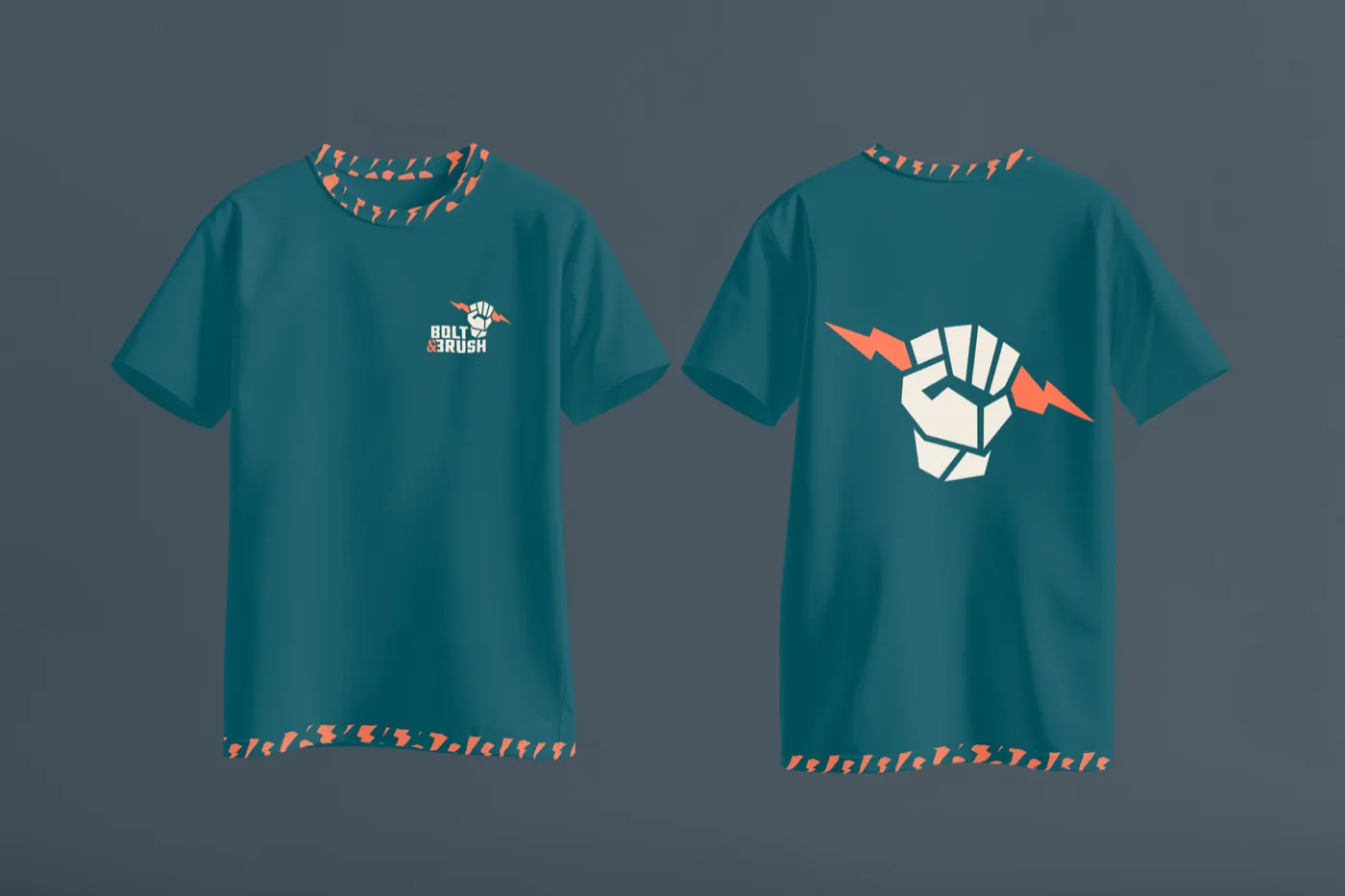
The lightning bolt as a repeating motif, for backgrounds, packaging and the inside of the business cards.