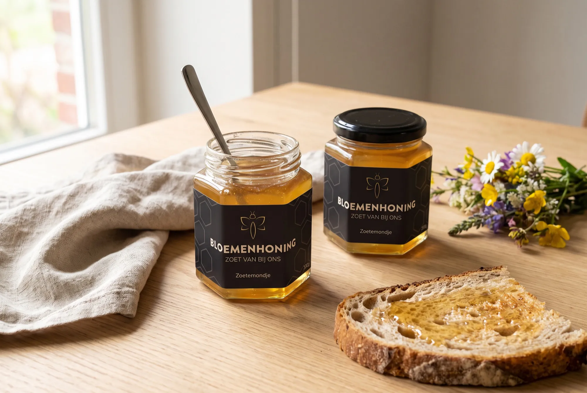
01
The bee
One line, no fill. That keeps the symbol light and elegant, and it also works in gold foil on a small label.
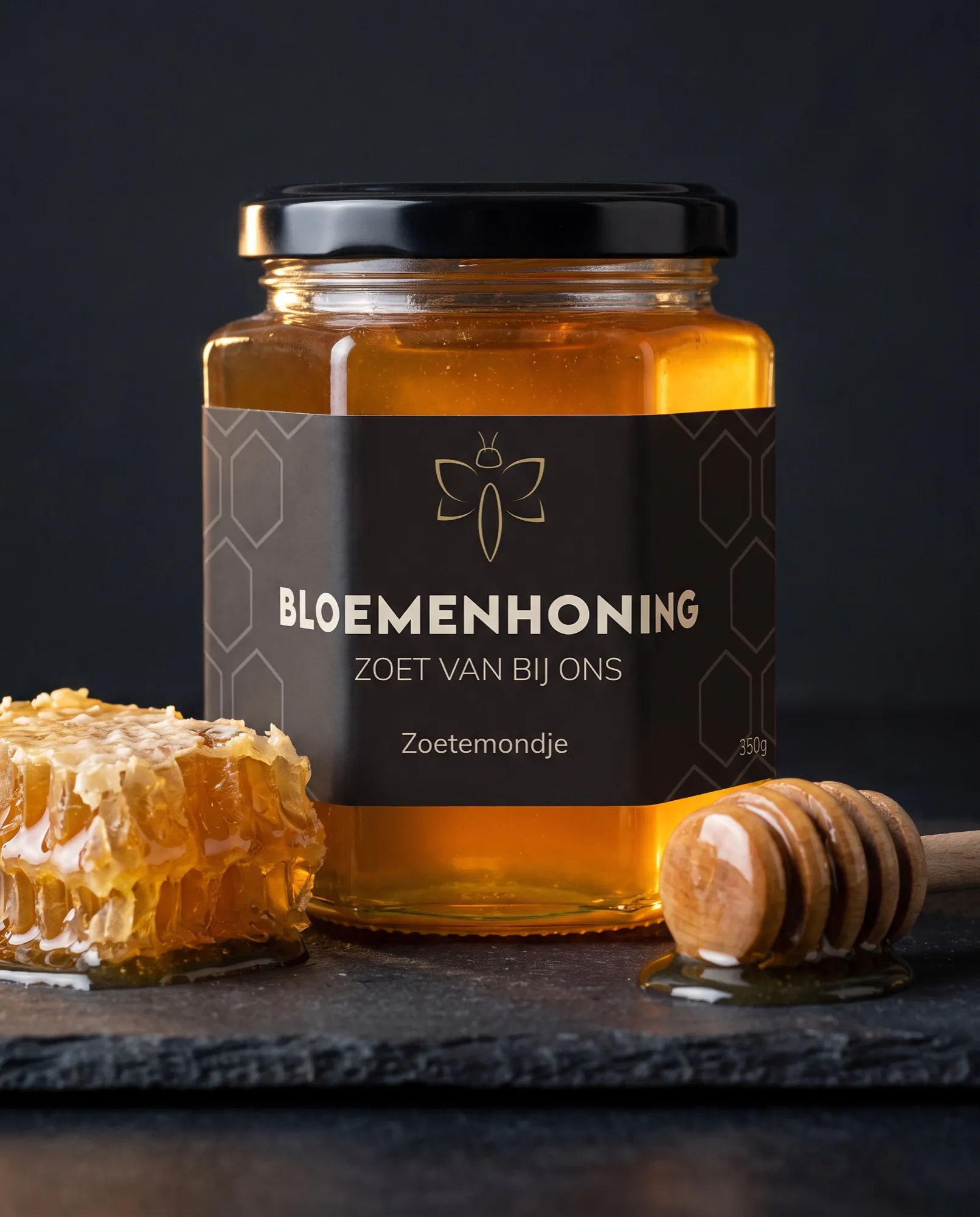
A label for the flower honey of a local beekeeper. It had to feel honest and handcrafted, but also that little bit more refined than the average jar at the market.
Black and gold, with a bee drawn from one continuous line. A grid of hexagons refers to the honeycomb, without turning into a childish honey pattern.
One line, no fill. That keeps the symbol light and elegant, and it also works in gold foil on a small label.
Black brings calm and lets the honey in the jar provide the colour. Gold connects the label to what is inside.
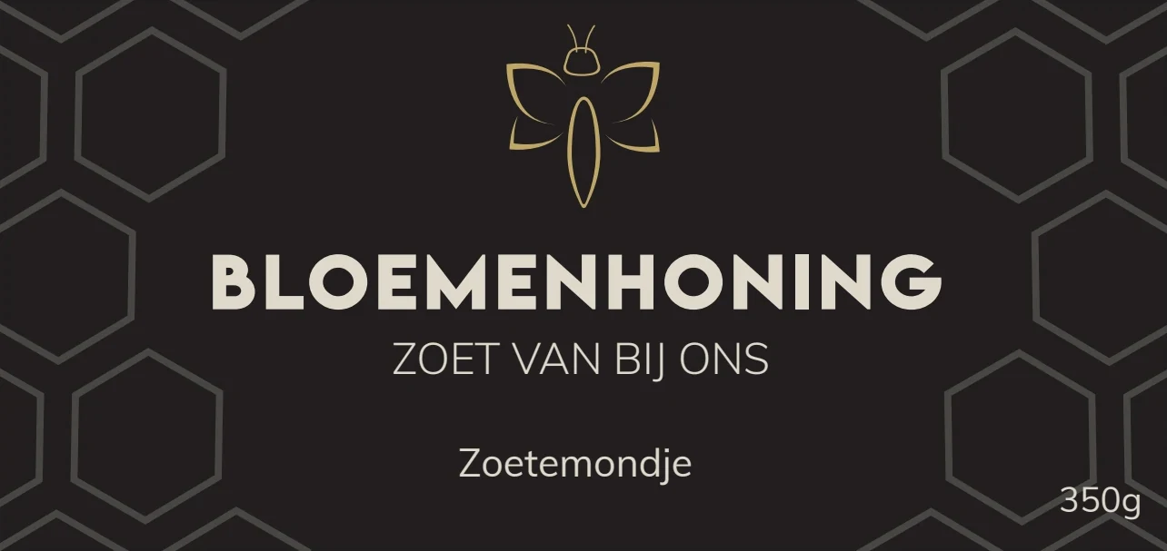
The brand at the top, the variety and the promise in the middle, the name Zoetemondje and the weight at the bottom. The hexagons run over the edge, so they continue around the jar.