01
The logo
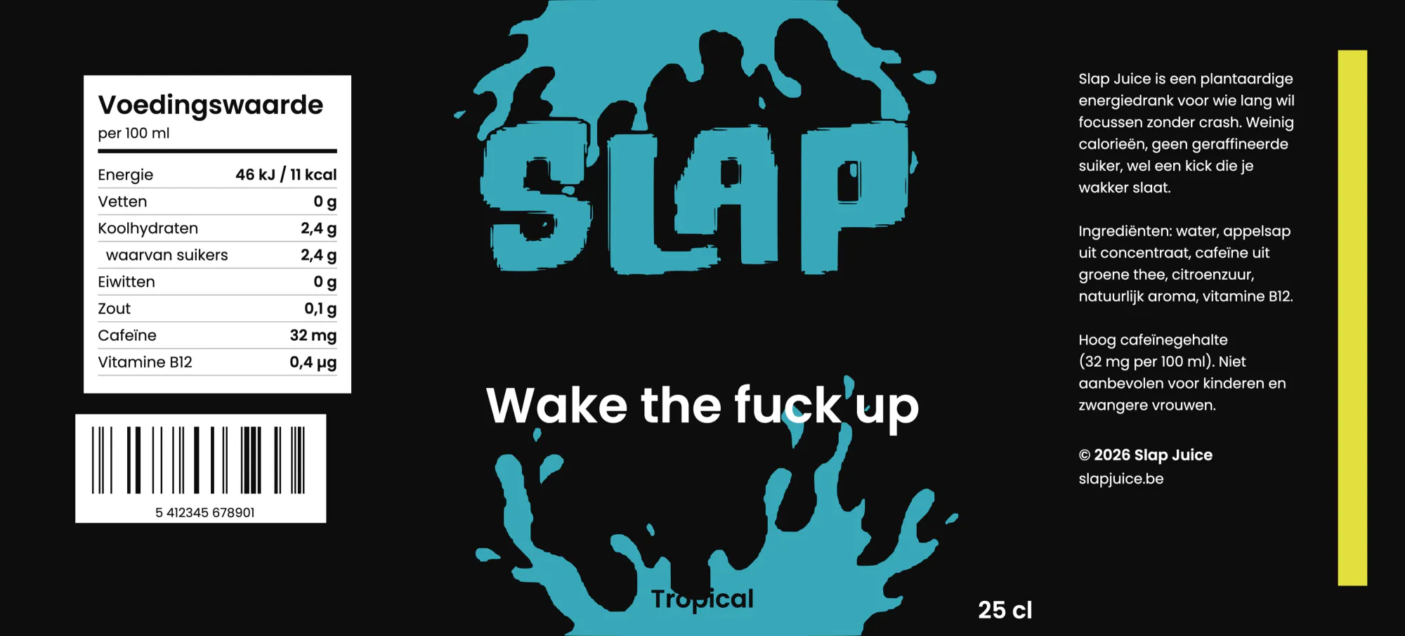
A thick, crooked wordmark that looks like it has just been thrown against a wall. It also has to stay legible when you grab the can from the fridge in a hurry.
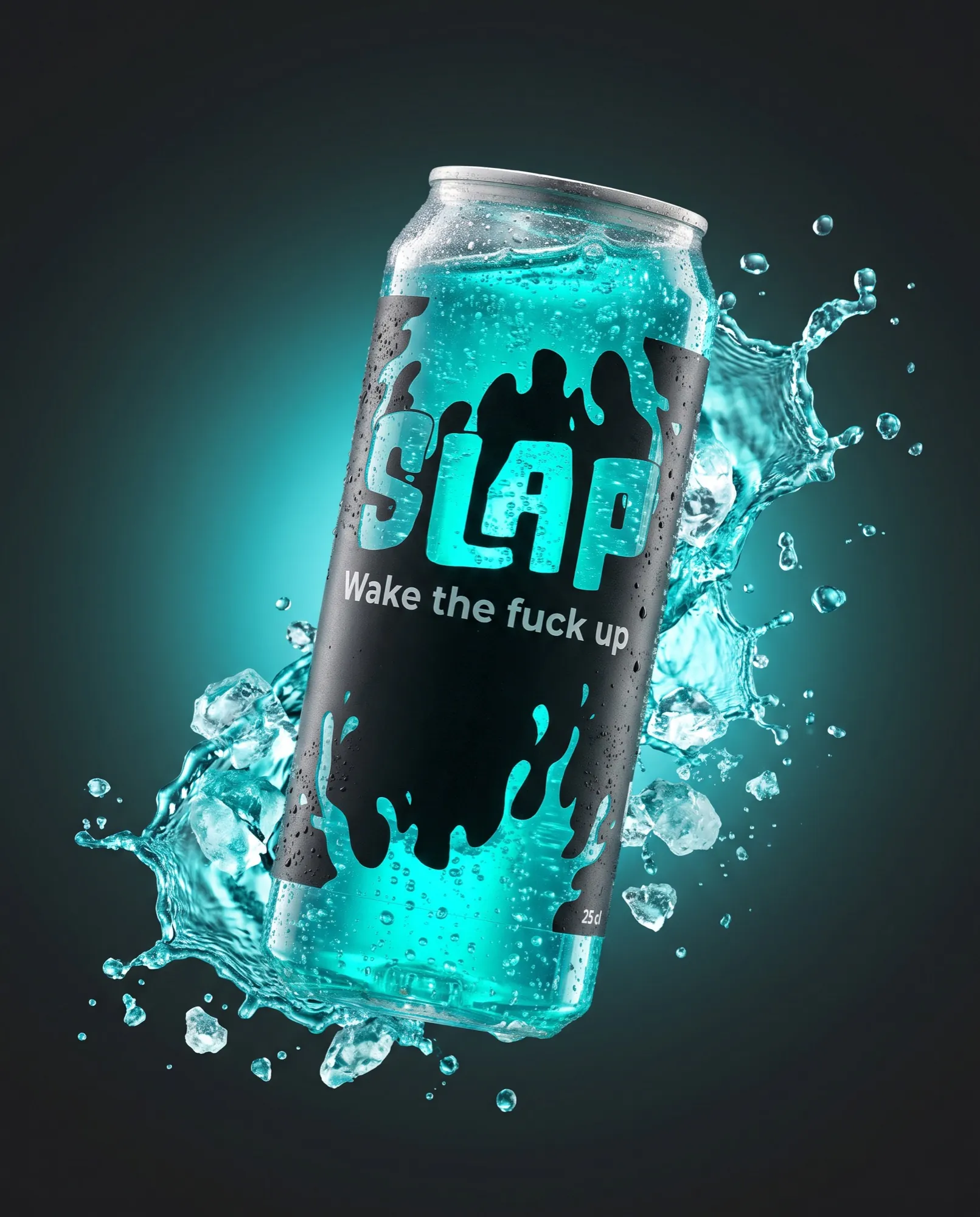
An energy drink for gamers, students and designers who want a boost without the crash. Plant-based and low in calories, but with an attitude that gives none of that away.
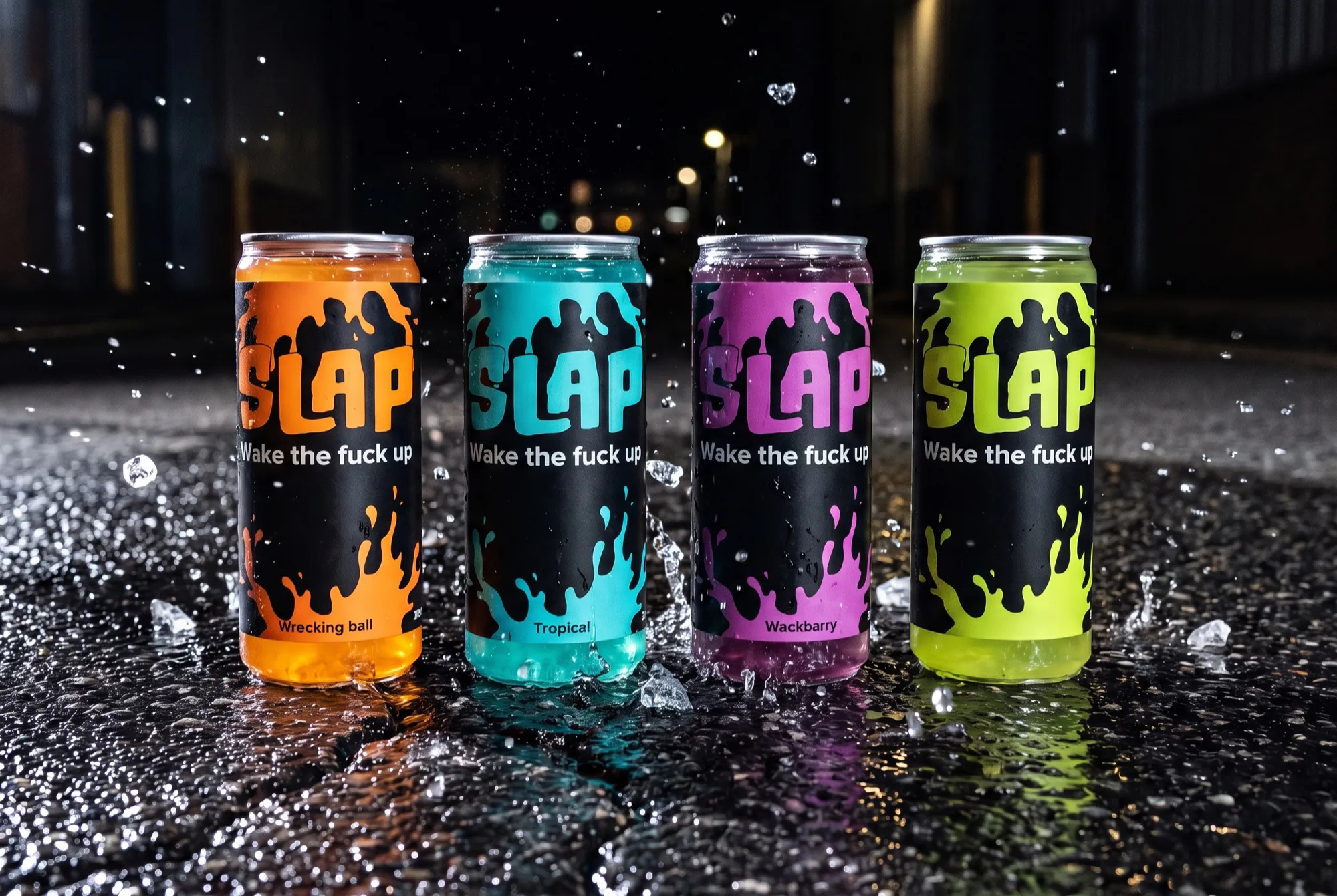
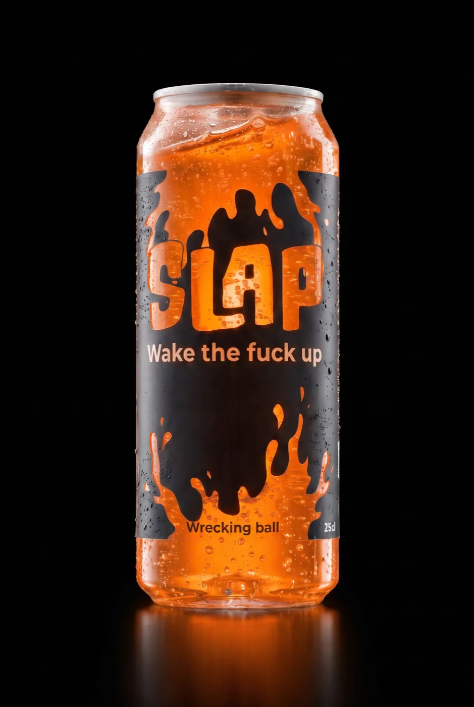
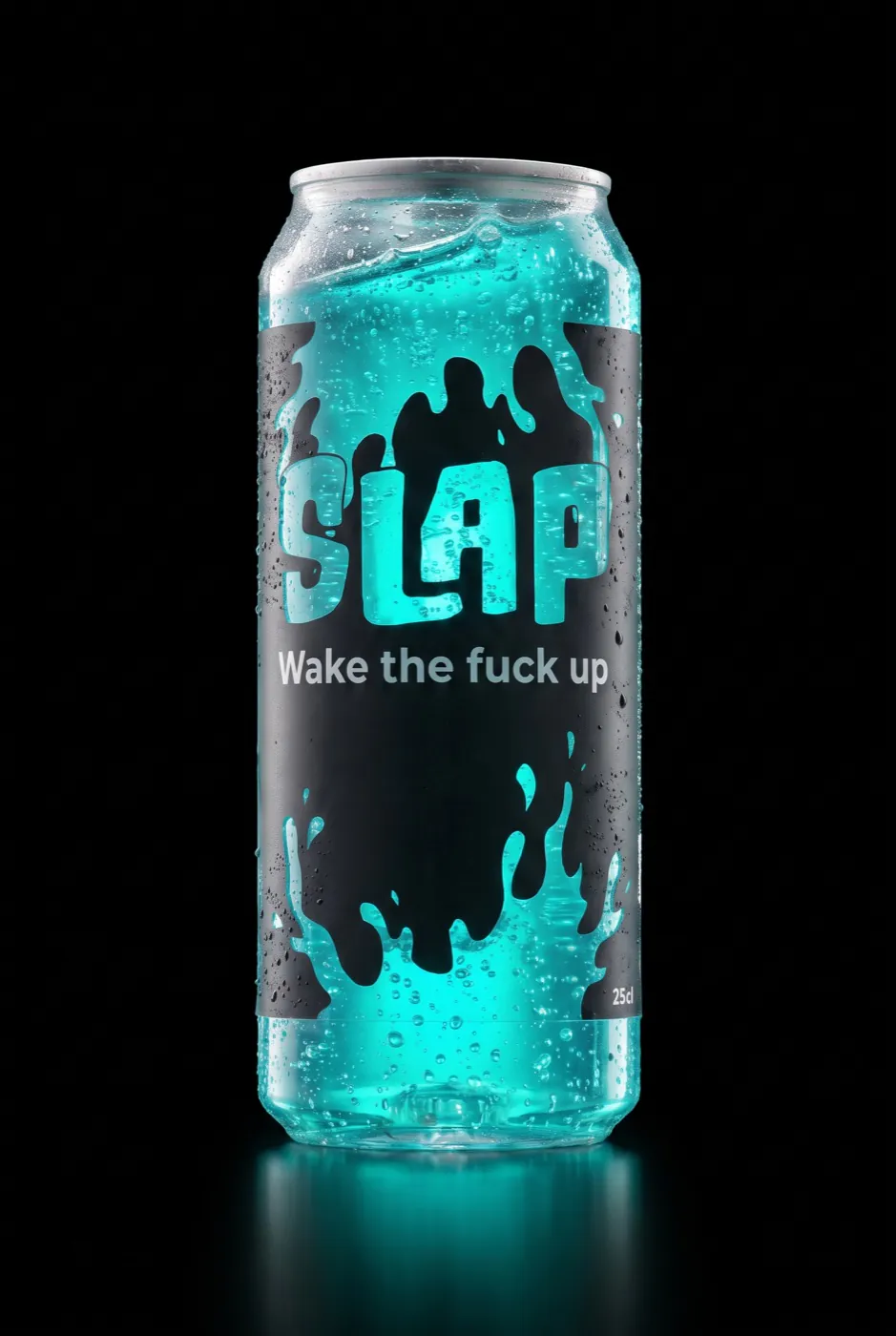
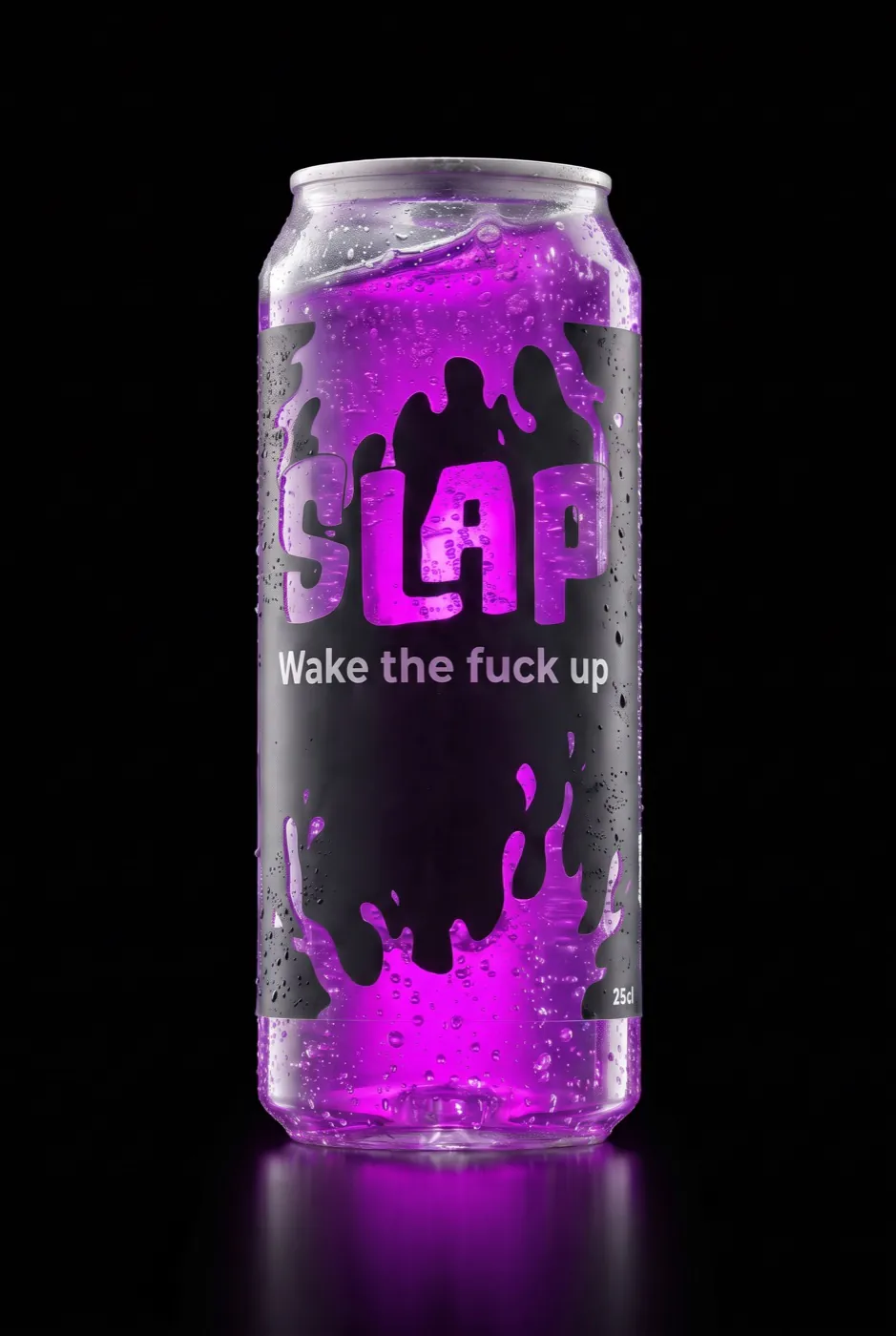
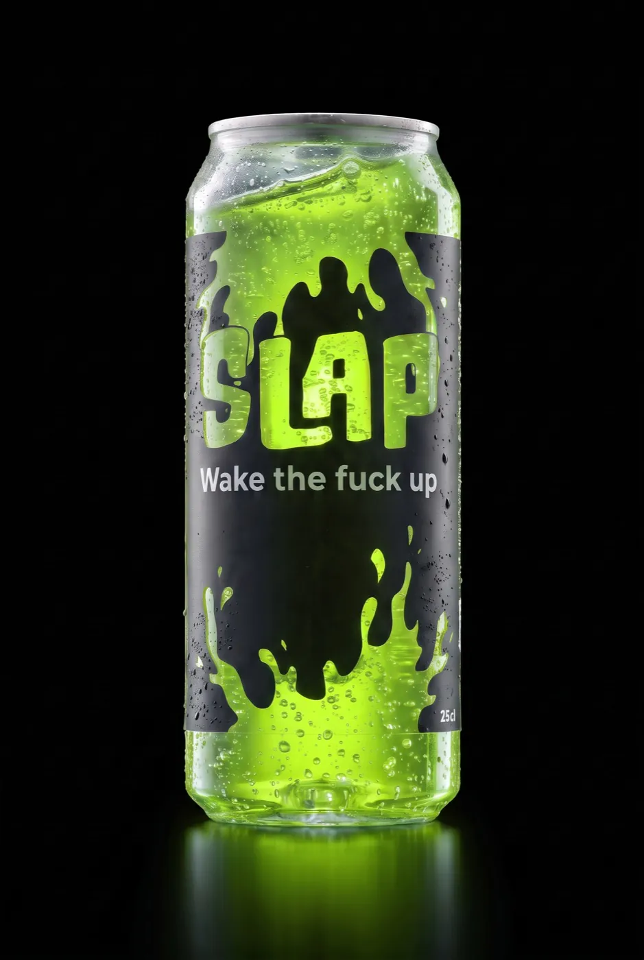
A can that slaps you awake. The label is black, with paint splatters and a thick hand-drawn logo. Those splatters are not printed: the can is made of acrylic glass, so the colour of the drink itself shines through.
A thick, crooked wordmark that looks like it has just been thrown against a wall. It also has to stay legible when you grab the can from the fridge in a hurry.
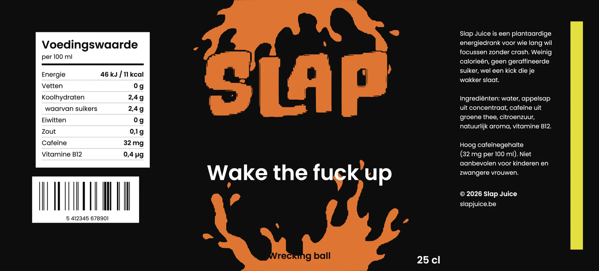
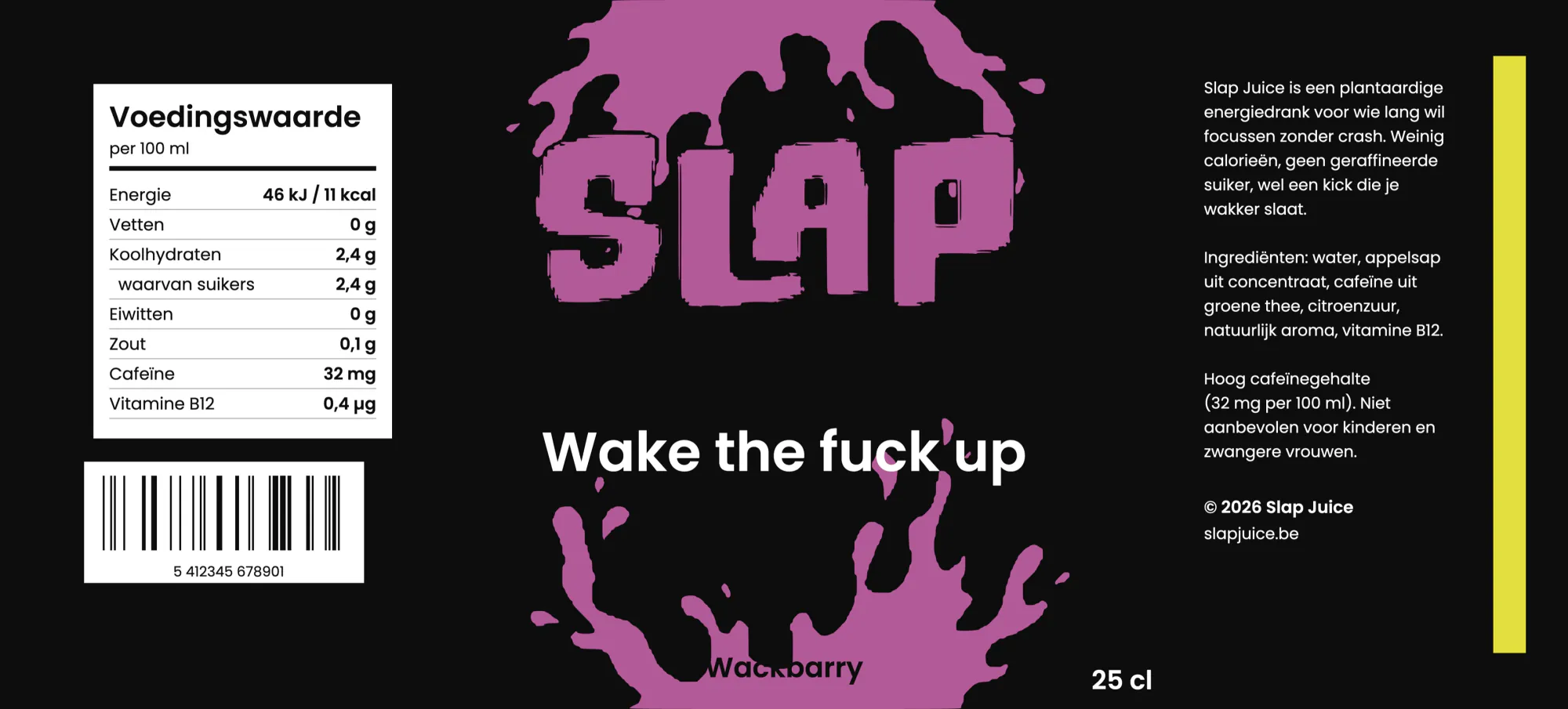
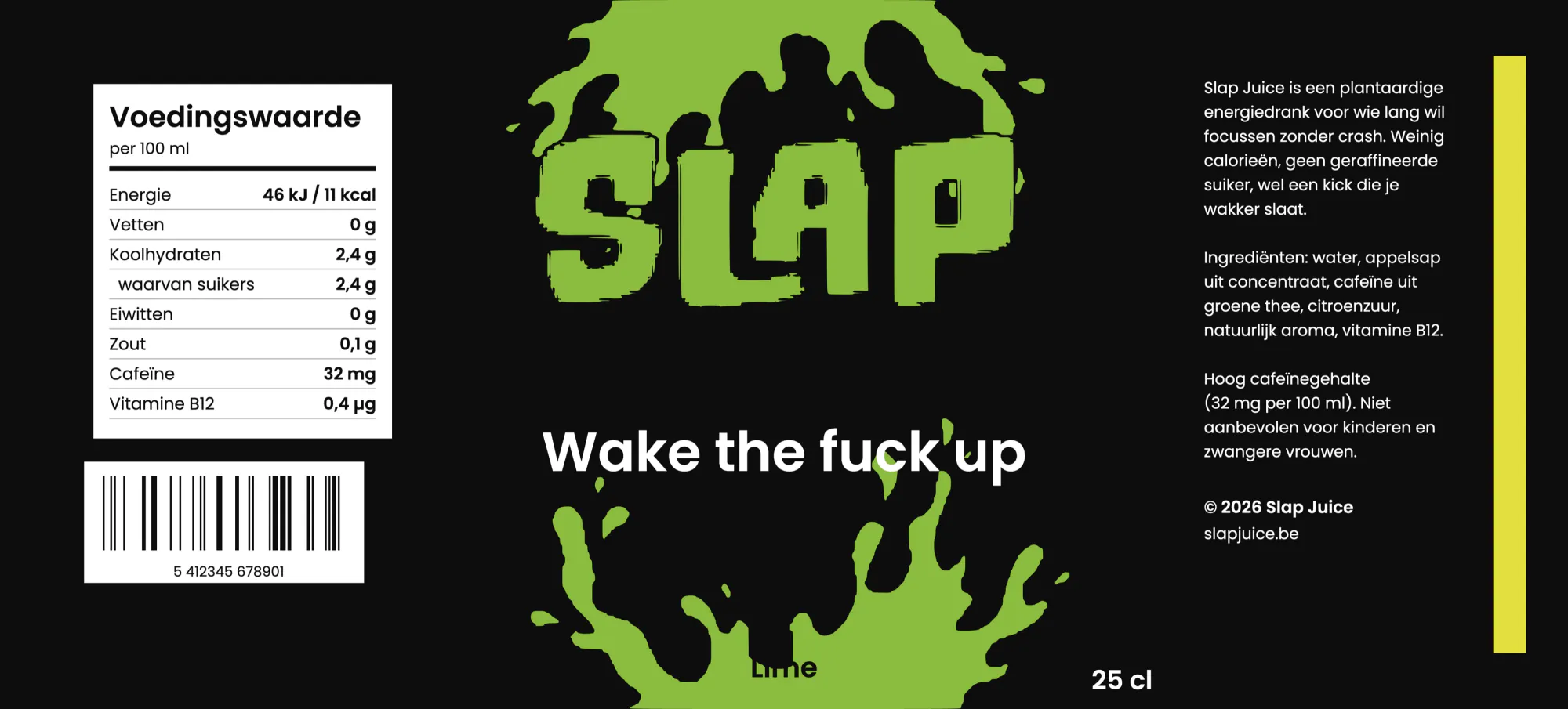
Wrecking ball, Tropical, Wackbarry and a lime version. Each flavour gets its own colour, the rest of the label stays identical so the range forms one block on the shelf.
Because the can is made of acrylic glass, the drink itself becomes the second colour. The fuller the can, the brighter the label. An empty can is instantly a recognisable object too.